Making DigiYatra User-Centric & Intuitive
by Aman Modi
Digi Yatra is an initiative of the Ministry of Civil Aviation (MoCA) and Digi Yatra Foundation. It aims to provide a seamless travel experience to air passengers by allowing them to verify their identity at various checkpoints without the need for physical documents.
Sounds good isn't it!
So what’s the problem??
CaseStudy
CaseStudy
CaseStudy
Making DigiYatra more User Intuitive
Making DigiYatra more User Intuitive
Making DigiYatra more User Intuitive
Figma User Research Ui Design Ux Design
Figma User Research Ui Design Ux Design
Figma User Research Ui Design Ux Design
Making DigiYatra User-Centric & Intuitive
by Aman Modi
Digi Yatra is an initiative of the Ministry of Civil Aviation (MoCA) and Digi Yatra Foundation. It aims to provide a seamless travel experience to air passengers by allowing them to verify their identity at various checkpoints without the need for physical documents.
Sounds good isn't it!
So what’s the problem??


Basic Onboarding screen


not readaable
carousel moves too fast, doesn’t give user time to read it
Not clickable enough
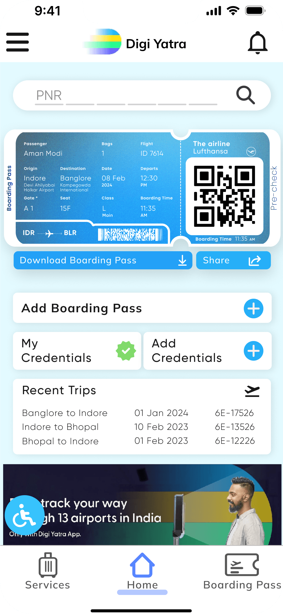
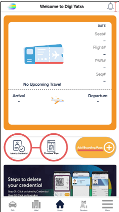
Poor Home screen
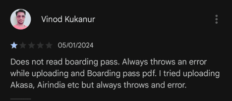
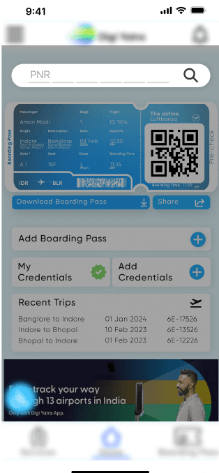
Adding boarding pass!!!


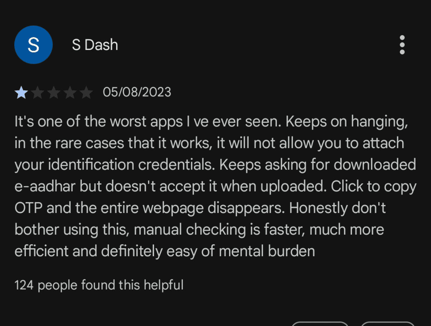
The DigiYatra App included three options for adding boarding passes: scanning the pass, uploading an image, or uploading a PDF.
However, users reported difficulties in which none of these alternatives worked properly. This resulted in dissatisfaction and an unfavourable opinion of the app's reliability.
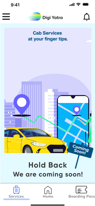
Too many coming soon screeens!!!!


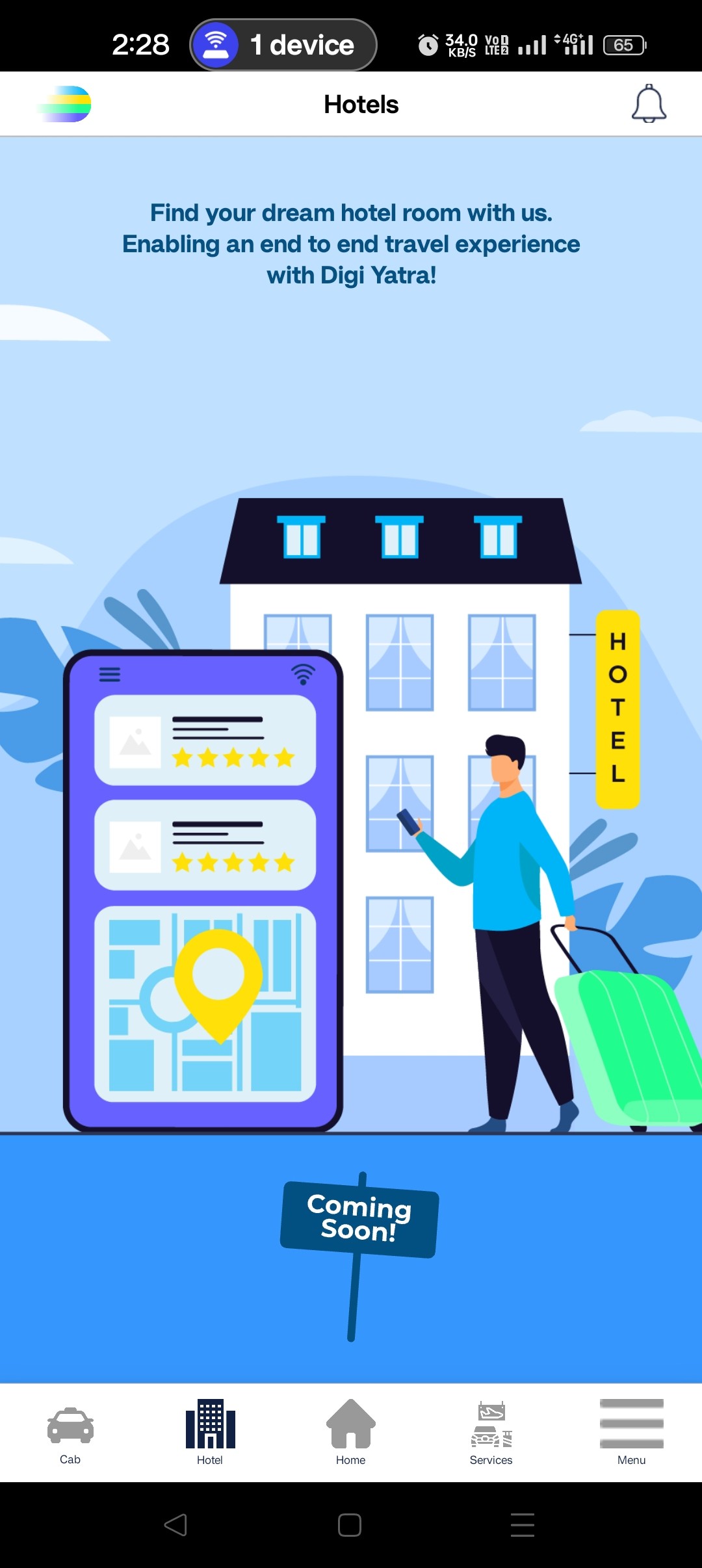


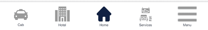
The home screen of the DigiYatra app offered three options: hotel booking, service, and cab booking. However, when a user selects these option, they left disappointed because a message appeared saying “Coming Soon”. This resulted in frustration and a poor user experience.
And many more-


Onboarding Screen-


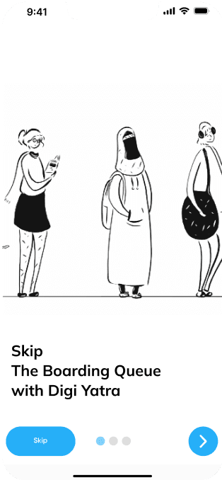

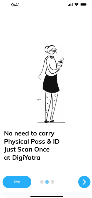


a User Friendly Informative onboarding screens helps user to understand how this App is going to help them, how convienently their user journey will be.
sO that was all about issues
Now let’s see what’s the Possible Solution
Making User Onboarding informational
Redesigining icons
Making another option to add Boarding Pass
Adding an Accessibility Button

Home Screen / PNR
To ease user frustration and enhance the app's functionality, a new option was introduced: entering the PNR number. This alternative method allows users to manually input their PNR number to add their boarding pass to the app. This addition aims to provide a reliable and accessible alternative for users facing difficulties with the existing options.
-From a psychological standpoint, the addition of the PNR input option addresses the user need for a reliable fallback solution when other methods fail.


Home Screen / Accessibility Button
The primary purpose of the redesign was to help users with disabilities, the elderly, and those in need of temporary support navigate airport environments more easily and confidently. To accomplish this, a "Accessibility Button" was added to the app's interface. This button functions as a direct communication channel for users to notify airport helpers of their arrival time and any specific assistance necessary.
-By prioritizing the needs of users with disabilities and providing a dedicated channel for communication, the app fosters a sense of belonging and empowerment among its diverse user base. This can lead to increased user satisfaction and loyalty.


Other Redesigned screens


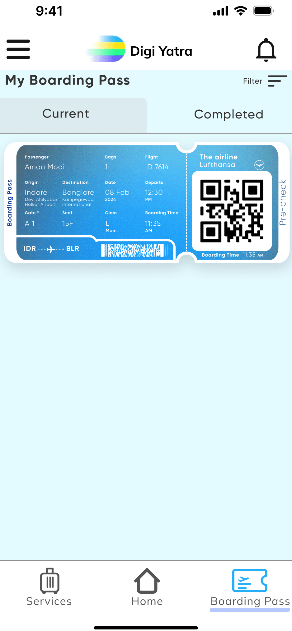
Boarding pass
Current
Completed
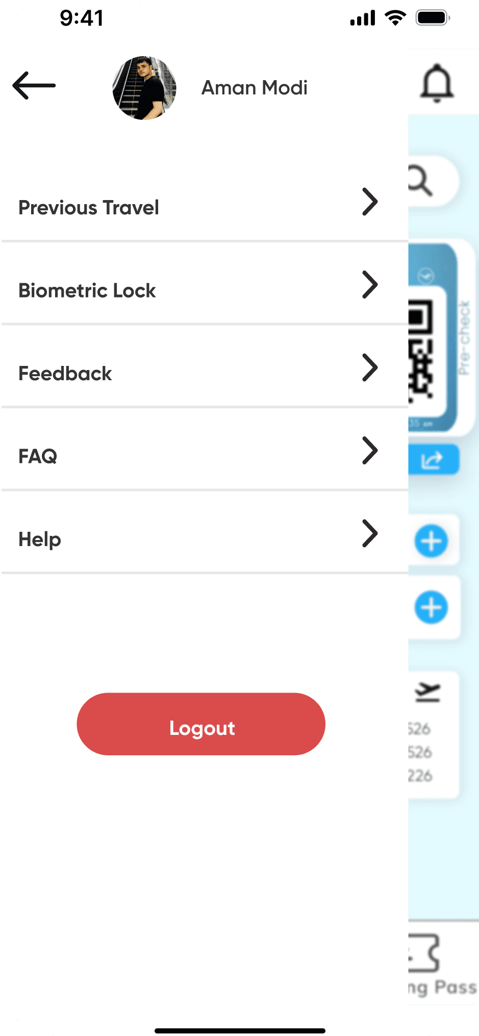
User Profile


Lots of coming soon Screens !!!

To address this issue and create a more user-centric design, I opted for a consolidated approach. Instead of presenting separate options for hotel booking, service, and cab booking, we combined them into a single unified carousel. Upon selecting this option, users are presented with a comprehensive view of all available services.
-From a psychological standpoint, this redesign leverages the concept of expectation management. By showing all services simultaneously, users have a clear understanding of what the app offers, managing their expectations effectively. This can lead to increased satisfaction and a more positive perception of the app.
Credits:
Illustration: NadaI Ishtewi-Behance; Illustrations(Plugin), Figma Community
ScreenShot : DigiYatra App
Other Information : Airport Authority of India
Thank you for reading
-Aman Modi


Redesigned Home Screen
Resized header
Hamburger button for user profile and menu
New PNR option
Clickable and visible font for adding boarding pass
and Credentials
Crousel with increased dealy time
Accessibility Button
Quick recent trip info.
Download and share option for boarding pass
sO that was all about issues
Now let’s see what’s the Possible Solution
Making User Onboarding informational
Redesigining icons
Making another option to add Boarding Pass
Adding an Accessibility Button
* Onboarding Screen-


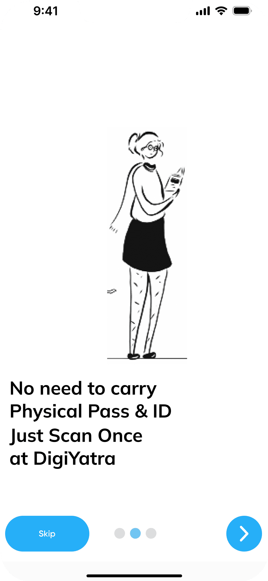


a User Friendly Informative onboarding screens helps user to understand how this App is going to help them, how convienently their user journey will be.

* Redesigned Home Screen
Resized header
Hamburger button for user profile and menu
New PNR option
Clickable and visible font for adding boarding pass
and Credentials
Crousel with increased dealy time
Accessibility Button
Quick recent trip info.
Download and share option for boarding pass


* Home Screen / PNR
To mitigate user frustration and enhance the app's functionality, a new option was introduced: entering the PNR number. This alternative method allows users to manually input their PNR number to add their boarding pass to the app. This addition aims to provide a reliable and accessible alternative for users facing difficulties with the existing options.
-From a psychological standpoint, the addition of the PNR input option addresses the user need for a reliable fallback solution when other methods fail.
* Home Screen / Accessibility Button
The primary purpose of the redesign was to help users with disabilities, the elderly, and those in need of temporary support navigate airport environments more easily and confidently. To accomplish this, a "Accessibility Button" was added to the app's interface. This button functions as a direct communication channel for users to notify airport helpers of their arrival time and any specific assistance necessary.
-By prioritizing the needs of users with disabilities and providing a dedicated channel for communication, the app fosters a sense of belonging and empowerment among its diverse user base. This can lead to increased user satisfaction and loyalty.

* Other Redesigned screens

Boarding pass
Current
Completed
User Profile


* Lots of coming soon Screens !!!
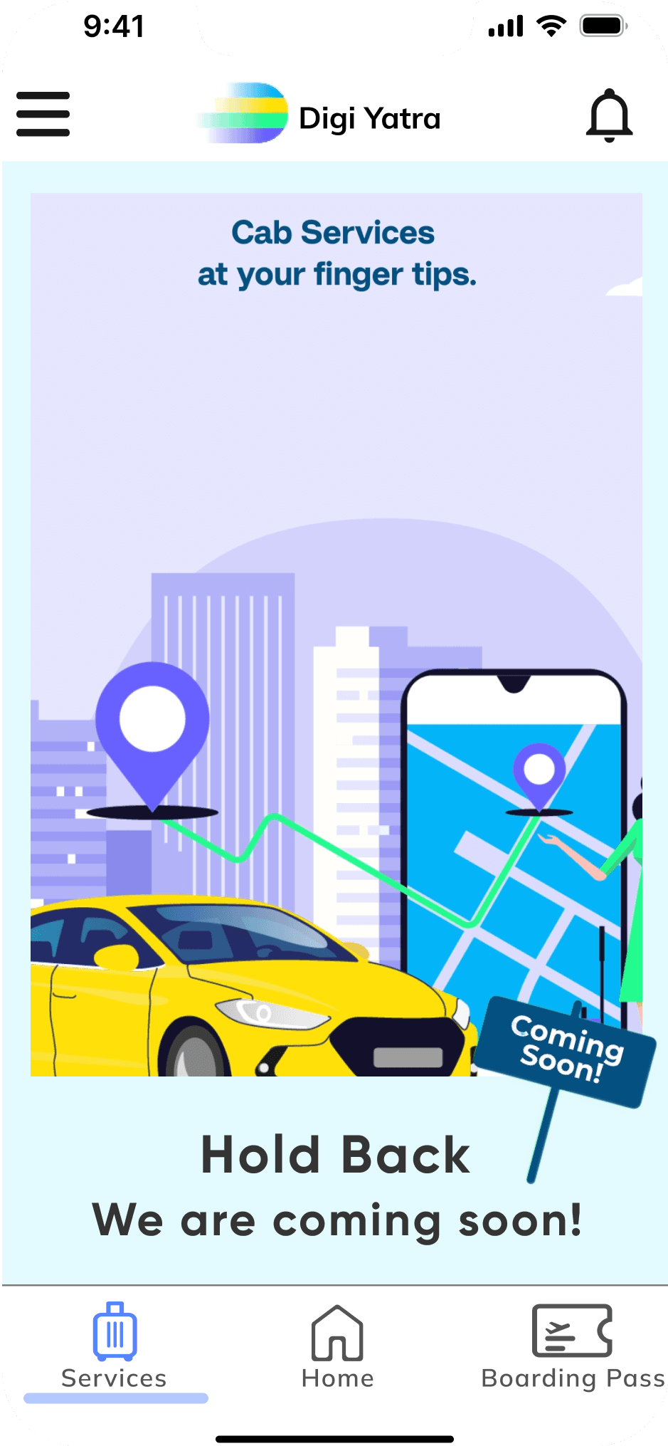
To address this issue and create a more user-centric design, I opted for a consolidated approach. Instead of presenting separate options for hotel booking, service, and cab booking, we combined them into a single unified carousel. Upon selecting this option, users are presented with a comprehensive view of all available services.
-From a psychological standpoint, this redesign leverages the concept of expectation management. By showing all services simultaneously, users have a clear understanding of what the app offers, managing their expectations effectively. This can lead to increased satisfaction and a more positive perception of the app.
Credits:
Illustration: NadaI Ishtewi-Behance; Illustrations(Plugin), Figma Community
ScreenShot : DigiYatra App
Other Information : Airport Authority of India
Thank you for reading
-Aman Modi
Liked my CaseStudy?
poor Onboarding screen
not readaable
freakingly small header, my mom Couldn’t
even click it!
carousel moves too fast, doesn’t give user time to read it
Not clickable enough
Home screen
Adding boarding pass!!!
The DigiYatra app included three options for adding boarding passes: scanning the pass, uploading an image, or uploading a PDF. However, users reported difficulties in which none of these alternatives worked properly. This resulted in dissatisfaction and an unfavourable opinion of the app's reliability.
Too many coming soon screnes!!!


The home screen of the DigiYatra app offered three options: hotel booking, service, and cab booking. However, when a user selects these option, they left disappointed because a message appeared saying “Coming Soon”. This resulted in frustration and a poor user experience.
And many more-